| 10/15/25 |
| LVL3, a gallery based in Chicago, also conducted an interview with me. You can read it on their website or on my website if you like my interface more. |
| 9/3/25 |
| Sorry for not updating here for a while, I've been neglecting this part of the site. I'm back and, of course, am making new clothes. For archival purposes, here is an interview I did recently. |
| 3/17/25 |
You can now subscribe to receive our recurring catalogue in your mailbox for one (1) calendar year. This catalogue is an extension of the log section of the website and will include more observations/opinions on culture-based trends, dialogues, and material from a variety of artist and writer contributers, including myself. It is printed in b&w ink on letter-sized paper that is folded into thirds (similar to a brochure) which will allow it to be shipped in a standard, USPS approved envelope. It will also include an index of new products. I hope to release these before every new clothing drop but don't count on it because my turnaround time for new clothing may outpace that of this new publication. So, like everything in this ever-evolving clothing brand, the catalogue's frequency is subject to change.
This inaugural issue of the catalogue precedes an Amazon Merch exclusive T-shirt drop, which will be the second official collection published through the Tbtraveler Diffusion Line, a sub-brand of the parent company Blank Traveler denoting a collection comprised of graphic t-shirts released in some new, unorthodox fashion. That collection comes out soon. Included in the catalogue is writing about why exactly this collection is released through the platform of Amazon Merch as well as a relatively in-depth Amazon review of Gildan T-shirts, a portrait of Jeffrey Chen in the form of his recent Amazon purchase history, an exclusive interview with Lauren Sanchez—Jeff Bezos' fiancé—conducted by Max Callimanopulos, and a mini-zine of Amazon delivery photos taken by Amazon workers.
Alternatively, instead of receiving it in your mailbox, you can download the pdf and (if you have a printer) print it out at home, saving me approximately 73 cents in stamp costs.
|
 |
| 10/07/24 |
| I have been working on the new collection for six to eight weeks, accounting for both mental and physical labor. These shirts are one of ones and were each constructed from 2-3 Gildan® shirts, ranging from the polo shirt—whose collar is a part of all of the garments—to the baseball tee. The designing process was quicker than the printing process and the printing process was quicker than the sewing process. I will discuss conceptual themes and walk you through the construction process in a later log. For now, enjoy the shirts. |
| 06/18/24 |
| Finished taking photos for the Beaver Brook collection. The camera was operated by Amar and the apparel was modeled by Max and Kiel (Keith). They turned out well. The photoshoot lasted only a couple of hours. I polished up on my face paint abilities. The collection will be available for purchase on Sunday, I think. |
| 06/14/24 |
| Almost complete with the designing of the new collection (July Fourth Weekend at Beaver Brook). I forgot to tell you guys that I had started on it, sorry. |
| 05/29/24 |
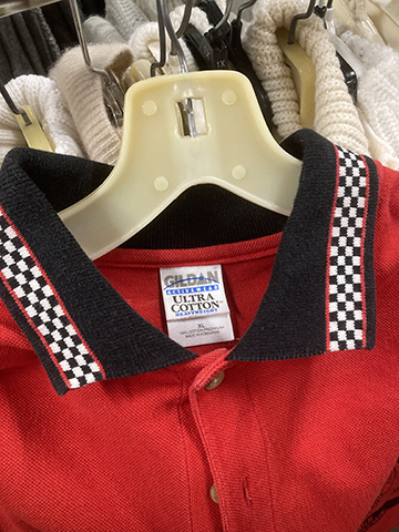 |
An interesting vintage GILDAN polo with a checkered collar.
|
| I found a cool GILDAN blank at a thrift store in Massachusetts. It appears to be, based on the tag, from the early 2000s and is a typical GILDAN polo blank except the collar and sleeve trim have a black & white checkered pattern. I did some research online and it seems like it was titled as a "racing blank" and was intended for vehicle-based sports like motorcycle and/or car racing. That explains the checkered pattern. Jerzees made some too. They have since been discontinued. I wish I could've used them for something. There's a site that sells a replica blank that they made but it's too expensive and I'm not sure how long shipping takes
|
| 05/21/24 |
| Some of My Notes on Tags |
For years I've been conflicted about clothing tags/labels as it pertains to this brand. Initially, when I first started in 2016, I was unconcerned with interior, experiential-based branding that was invisible to the clothing garment when in use. This meant I didn't have tags, labels, stickers—all the tangibles that are commonplace in clothing companies aside from the clothing item itself. I was fairly myopic, practical, frugal, and wanted only to make a cool graphic. This version of me has remained steadfast in the brand's identity even to this day. However, as I grew older and went through a rigurous arts training in the form of "school" ("university" in the UK), I grew to become respectably literate in "graphic arts" and passably to reasonably literate in "fine arts". These two, although both operating in the same "art" world, were often at odds; the former praised commerce, while the latter denounced commerce. I thought both had valid points. In graphic design, there exists an explicit brand and/or system that is worked to be made overt so that the brand can be easily recognized which will generate them more money. This logic argues for a customized, branded clothing tag since that is what will improve the brand image (and generate more money). From a business standpoint, this makes sense.
On the other hand, the business as a functioning ("fine") art project hopes to exist on a different plane—one that a custom tag might interfere with. In jeopardy are my themes relating to:
- Readymades, which is defined by Tate as a term "first used by French artist Marcel Duchamp to describe the works of art he made from manufactured objects". I enjoy this term because it often justifies (in a poetic way) the use of cheap, mundane, and accessible things in high art. This manifests for me in this project as a premade, "blank" T-shirt.
- A focused labor, where all available energy is put towards the graphics and everything else is treated with an irreverance that could possibly produce interesting aesthetic results as a byproduct. This often works well and is best seen in graphic design, where an indifference toward font size or hierarchy creates cool compositions within its system.
- The family business (my parents T-shirt company), where GILDAN is used in an uncharged, reductive manner for purely economical reasons, producing an honest, earnest, and authentic thing.
The moment I rip the GILDAN tag out of the shirts is the moment these ideas become unfounded (if they were at all in the first place).
But, to not rip it out is to say I dislike money, which is untrue. Mainly, from a money perspective, I am concerned with brand visibility in non-my-webstore-or-this-website environments—i.e. stockists. In a physical store, it's crucial (to a fatal extent) that a browser/potential customer knows where the product comes from; exposure, visibility and follows are all at risk when you don't assert your brand name on the garment. Additionally, a custom neck tag has a certain professionalism to it that is probably respected not only by the consumer, but by the store owners/buyers alike. I have no expectation that my loose, aforementioned reasoning for keeping the GILDAN tags in is thought about in any form. It most likely comes off as lazy, which is not a desirable trait for a brand owner. I also wonder if they are ever embarrassed of the tags or if they rip it out themselves.
That brings me to these new, heat transfer tags I am experimenting with. As of now, they are only present in garments that are in physical stores. They are square, 1.5" DTF tags that cost $0.10 each. They require 25 total seconds (15 seconds, cool off, peel, 10 more seconds) of heat pressing and seem to be fairly durable. I will most likely start to use them on direct-to-consumer products for the next collection. As of now, the GILDAN (and Hanes®) tags remain in. Also, GILDAN just recently changed to a new tag, marking another arbitrary era for the titans of the industry. They march forward no matter how much they are shit on by the insufferable, pretentious "streetwear" industry.
|
 |
 |
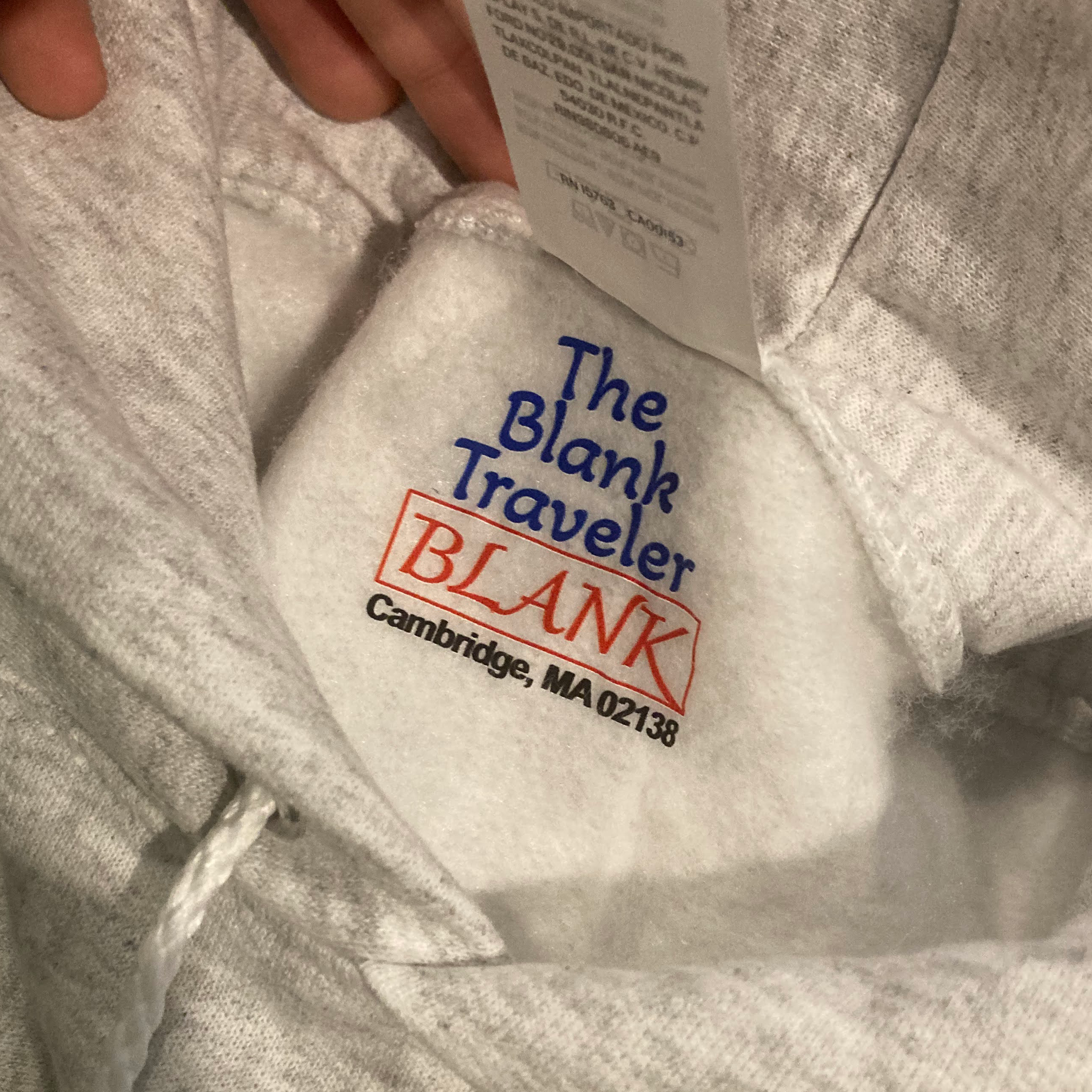
The Blank Traveler heat transfer tag (blue and red); for lighter colored garments and/or non blue and red garments. |
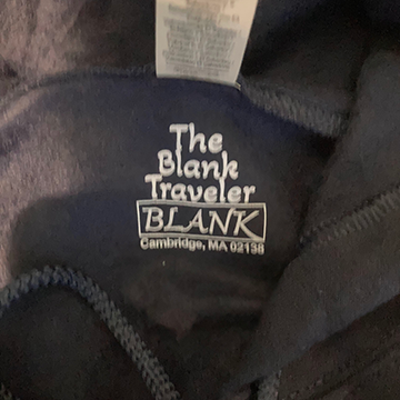
The Blank Traveler heat transfer tag (light grey); for darker colored (>50% grey) garments and/or blue or red garments. |
 |
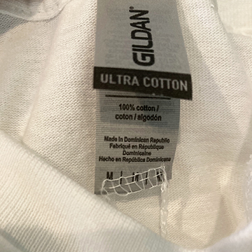 |
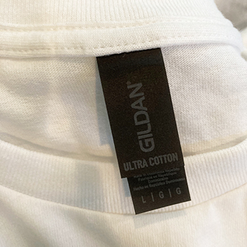
This is Gildan's new tag. They are now a satin-y black with silver/grey text. If you received a shirt with a black tag, the blank was produced this year, probably sometime within the past couple of months, I'm estimating. It's harder to read...an interesting and unexpected choice from the corporation. I am excited by how daring it is. |
This is Gildan's tag that was just replaced. It is silver/grey with black text. If your shirt has this tag, it was most likely produced in the 2020s, prior to 2024. Before 2020, Gildan used white tags, as shown below. This specific one has a funny stitch manufacturing error on it. |
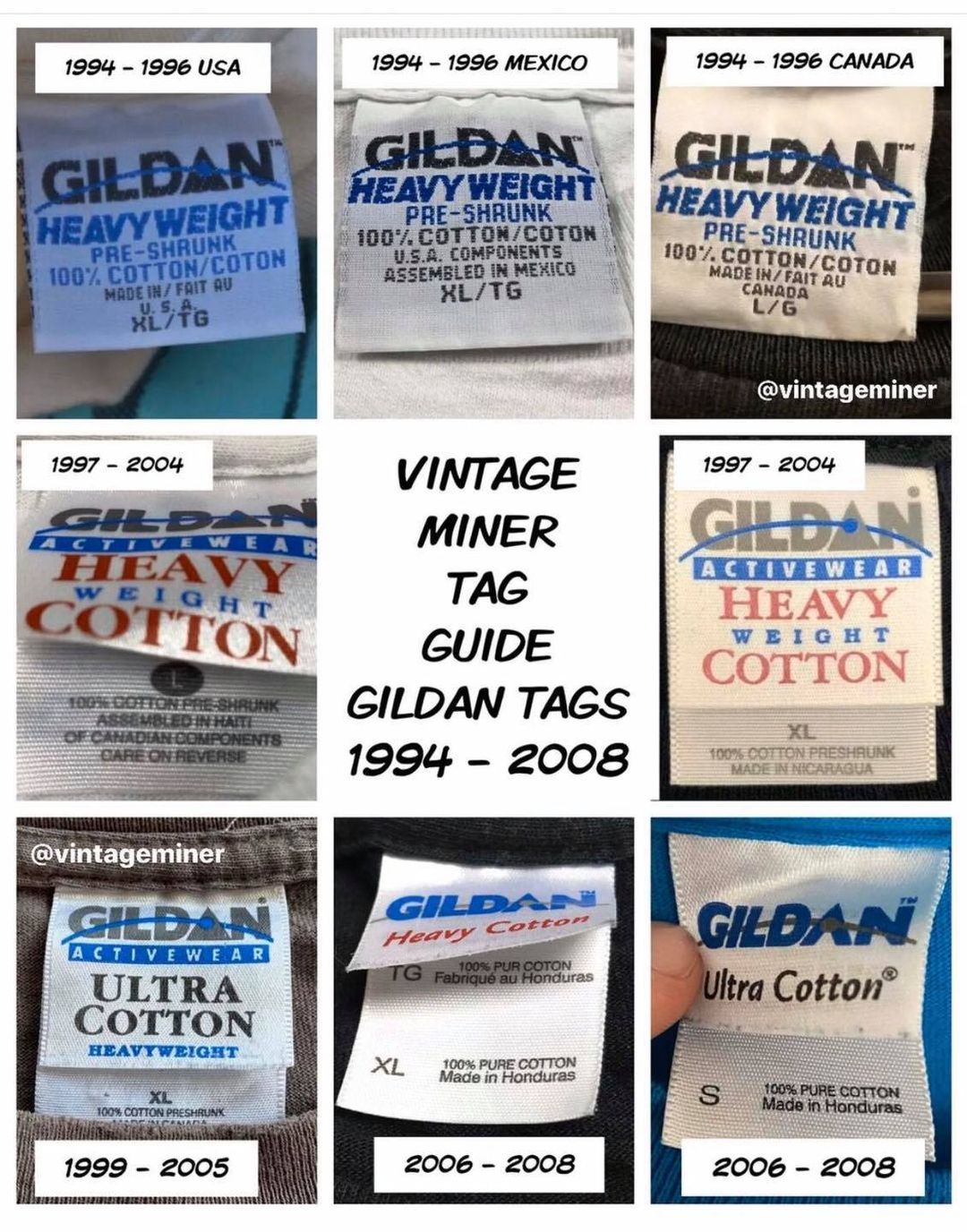 A guide to Gildan tags, by year. |
| My new heat transfer tags are a loose homage to earlier GILDAN tag designs. I do, however, also enjoy the new GILDAN tags (silver and black). I think they speak to this era's in-between aesthetics in a blunt, unabashed way.
|
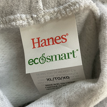 If you purchased a Alewife Shrine Hoodie (grey pull over), you will see this tag. Yes, it is Hanes. Gildan does not produce my desired color of ash grey. I'm unsure of what ecosmart means. |
| 05/04/24 |
| Lookbook photos are complete. Currently deciding when to release the collection and how to properly build up hype with several instagram posts. What is the proper number of posts to make? One does not want to post too much or too little. |
| The lookbook photos of this collection takes place in a few different locations, both indoor and outdoor, with a few of my friends modeling and aiding in creative decision making. I think they are by far my most complete and interesting scenario-based photos of the clothes on people, which is partly due to the collaborative environment that I allowed for. Most of the time I enjoy making solitary creative decisions, but, for photoshoots especially, I've learned it's good to be receptive to input from others. |
| 05/02/24 |
| I have been informed from a trustworthy source of some Firefox-specific problems with the website, in which the menu wheel on the homepage is not working properly. It will be fixed shortly. I apologize for the inconvenience. |
| 04/20/24 |
| Thinking about both traditional and nontraditional marketing methods for the new collection, both of which I can not reveal. I am keeping them secret. |
| 04/18/24 |
| Starting to work on this website. |
| 04/12/24 |
| Product photos for the new collection were taken. |
| 04/11/24 |
| Production of the new collection for photo and marketing purposes is complete. |
| 04/09/24–04/11/24 |
| Underbase Experiments |
It has long been sought after: the ability to efficiently print light graphics on dark garments using direct-to-garment printing as the process requires a few extra, fairly laborious steps that are often more trouble than its worth. In my efforts to create a thematically interesting and financially successful clothing brand, I pretty consistently feel the need to expand into the dark garment territory even though my tools may not be built for it. This cumpulsion stems from a few insecurities/desires:
- A majority of people prefer dark garments to light garments (specifically black and/or navy blue). Not many people wear white or grey T-shirts or hoodies.
- I feel the need to diversify the color palette of the blanks I am using for aesthetic-driven branding reasons.
- I want to explore different color interactions, generally.
In the new collection, I have two hoodies that employ light-on-dark printing. Having been through the traditional process of pretreating + underbasing for previous collections and finding it to be unfruitful, I decided to explore new, alternative ways of printing light graphics on dark garments. Ultimately, I did decide to stick with the aforementioned process of pretreating + underbasing, but I figured it would be helpful to others if I shared my failed experiments seeing as there is a lack of information about different techniques online.
|
 I came up with the idea of screenprinting on a rectangular underbase even before seeing it had been discussed on the forums. It seemed, from a purely hypothetical standpoint, a real possibility considering the opaqueness of screenprinting ink. Additionally, I had a few photo based graphics for this collection which were contained within a rectangle—because of the lack of emulsion-based resources (power-washer, transparency printer, exposure unit, etc.), I figured you would only be able to theoretically print graphics contained within a rectangle. Also, because of possible registration issues, you would need to consider leaving some margin for trapping purposes. The main concern presented by others online was the combination of plastisol and T-Jet inks and if the two would interact well. After consulting the team (my dad) and watching a fairly convincing youtube video, I decided it would be worth a shot and bought a 20x24" Blick screen, a medium sized container of white Speedball® Fabric Ink, and a 8" wooden handled Blick Squeegee. I then screenprinted a white rectangle on a scrap, navy blue hoodie. |
 After letting the screenprinted white square dry, I tried a few different order combinations of heat-pressing, pretreating, and not pretreating. The above photo is a result of screenprinting then heatpressing then immediately DTG printing then heatpressing again, in that order. After that last heatpress, the print actually looked quite good; it seemed to be sitting atop the plastisol screenprint ink nicely and looked more vibrant than using the white ink underbase from the T-Jet. Alas, after doing a quick wash test, the DTG ink washed off, leaving the ever-ghostly void of the white screenprinted rectangle. |
 Here is a photo of a test print after I ultimately decided to return to using the white DTG ink on a pretreated garment, much to the T-Jet's chagrin. One of the problems with white DTG ink, I've been told, is its consistency, which is partly an adhesive glue-like substance, which is damaging to the print head, which often gets clogged by the ink. It is a sacrifice one must make, however. On the left is the print with 3 underbase passes (coats of white ink) and on the right is the print with 2 underbase passes. After some tweaking with the "Ink" button on the T-Jet, the 3 underbase option proved to be satisfactory and I proceeded with that method for the final hoodies. |
| 04/09/24 |
| Printing |
 Positioning of a sleeve/shoulder print. Height adjustments are necessary because of the seam connecting the sleeve to the torso. |
 A technique I use to maximize the width of a continuous graphic is arranging the shirt on the printing tray perpendicular to the printer itself. The graphic should be rotated 90 degrees clockwise on FastArtist. This allows the graphic to be approximately 17" wide. |
 Positioning tests. |
  I put parchment paper on the printing tray behind the sock when printing in order to print an all over design without getting ink on the tray. I later extended the graphic to 12x16" to allow for more room for error. |
 Color tests. |
©2026